Reading this post you were able to watch a video about Plasma Mobile (actually, Plasma on all kind of devices) and see some screenshots. But if you don’t know the ideas and concepts behind that, you are just going to bash it as it’s just the bootstrap of the project and a lot needs to be done.
And if for some reason you are wondering about the future of the netbook project, don’t worry 🙂 Plasma Netbook and Plasma Mobile, besides being oriented for smaller form factors than a regular Desktop / Notebook, have different concepts as they’re serving for different purposes. Marco (notmart) and all the Plasma team will still keep working on the netbook shell and if you read this post you can see the netbook shell running on Intel’s Jax10 devices. This was done to give us an idea about how the netbook interface would behave on touchscreen devices and helped Marco to do a lot of bug fixing and improvements.
Back to the mobile shell, this interface presented here was created for the same Jax10 device but the architecture was designed to support different “Views” (as in MVC) for even smaller devices (N900 anyone?) , while still sharing the same concepts though. Even if the interface was not designed for the N900 for example, we were able to run it with great performance and the usability was very good. What means that we’ll just need to slightly tweak the view to make it perfect for the N900. And all of this can be done by designers as the View is 100% done in QML 🙂
So our first step was to brainstorm about launching menus (and how regular grid views seems to be so boring) and how different contexts affects the way you use your mobile. I mean, we are making desktops aware of contexts more and more and it’s silly to think that you don’t use this concept on your other devices.
We thought about having regular activities so the user would be able to have different set of plasmoids for each context that he’s working on. However it still needs to be very easy to do some stuff like:
- Going to your dialer if it’s a phone;
- Change between activities (later we can make the shell location aware so it’s possible to auto switch);
- Launch applications easily and context aware (presenting the applications related to that context);
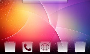
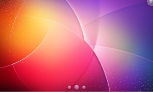
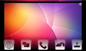
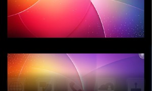
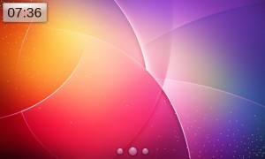
In order to achieve these goals we came with this idea: having a regular containment and a kind of panel that auto hides itself after some seconds. Important to say that right now this panel is 100% QML and is not like the desktop’s panel (that is a containment in another view). This makes the shell use less memory and be faster as it’s just playing with pixmaps in the end. After hiding, it shows a collapsed representation of the panel at the bottom that the user can either click on it or drag it up to show back the panel. This makes it really easy to change between one activity to another one while keeping the user interface clean enough so the user can play with his applets 😉
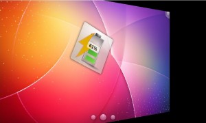
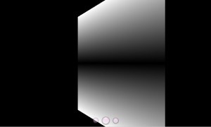
But then you ask me: “I want to launch applications ? How can I do that ?”. One solution is to add an application launcher as one of the main activities and the other one is to enable context aware application launchers. So, looking at the pictures above think that you are at the “Internet Activity” and you want to launch your applications. You can always launch the application related to one plasmoid from it so if you have an RSS Feed plasmoid you are able to launch your feeds reader using this plasmoid. But if the applications doesn’t have a related applet, in our concept you can just flip horizontally the current activity and you’ll find on it’s backside a context aware launcher that have shortcut icons for your applications and it’s size is proportional to the times that you launched the application and how much related to that activity the application is. This way it’s easy to find the most important applications for that activity.
It’s not there right now but the idea is that at the top we will have this small bar (that will be a containment) to show the status related widgets like battery, signals strength and other stuff very plasma, like clocks! It’s not there yet, but it will be!
Regarding the transitions from one activity to another we thought about sliding the activities up and down so there is the idea that we are throwing the current activity somewhere else and bringing the new one.
\Basically this is the concept behind the Plasma Mobile shell and after this it was just a matter of thinking about nice animations that would make sense, tweaking it’s timers and polishing icons 🙂 It’s clear to us that during the development we’ll find flaws in this ideas and we will need to fix them, as well as that the implementation right now is a little bit dirty due to time constraints (Tokamak doesn’t last forever unfortunately). Next steps ? Fix all the ugly code, finish implementing the launch menu, polishing and bug fixing…what means that we just bootstrapped!
Ah, if you are wondering: the Plasma Netbook project still keeps up to speed and is not sharing this backend (besides sharing a lot from libplasma). The deal is that the Netbook really needs it’s own concept and implementation while Plasma Mobile is really meant to be used on smaller devices than netbooks 😉
Plasma Mobile before deploying
I would like to thanks all tokamakers for providing great ideas and also INdT’s designers that gave me great ideas along the last years that I could apply for this concept.
This was good fun to do, and just proves how freaking amazing our core technology is, doing this is just a few days was amazing.
I honestly haven’t decided if using QML stuff is crazy awesome or just crazy. 😀 I guess its power is that it integrates so well into C++. But I still wonder how this will work as you scale up plasma-mobile into a full project.
@Ian Monroe: Well, we are going to discover that too, but I think that using it to define the view of the whole shell and keeping a backend that correctly exports the model to it is going to work well. Let’s see 😉 QML itself still has some problems but we can fix them 🙂
how the interface will react when the mobile is in vertical position?
@Lionel: the Jax10 device does not support the vertical position (it does not have an accelerometer) and this interface was designed for it. However we can use the same concept when implementing an UI for the n900 for example and them support the rotated version. This is something that our designers still need to work on, but the current Maemo5’s homescreen also does not have a vertical version and we can stick to the current UI while the designers doesn’t create the rotated version.
@morpheuz apart from the widgets view the ui is rotatable 🙂 me and Marco thought how that would work 😀
I find the desktop switch widget/plasmoid very convenient even for the typical computer desktop, good job.
@morpheuz: well this does look like a useful and fun way to push the boundaries of QML. I look forward to watching your progress.
Pingback: KDE for Desktops, Tablets and Mobiles? - Open Source and Linux | TechEnclave
simply…. awesome!! keep us in the loop if you find QML tearing at the seams!
@Lionel: this is a brutal proof of concept:
http://www.notmart.org/index.php/Software/A_vertical_Plasma
note that no work has been done here to specifically adapt the ui, and is not that bad, so with a bit more work on that could get perfect ™ 🙂
@Marco
Thank !
Keep playing, it is so cool !!